Chart: The climate models have been uncannily accurate – My Comments and Questions
[Charles sent me this. And I looked at it and decided to publish it, because it seems reasonable. I have come across mention that satellites are showing the extent of ice loss at the poles. So it does seem as if the ice is melting at a massive rate. But then the question is: What is the climate expected to be like in 20 or 50 years time? Remember sea levels should rise. And what about deserts? So I would like to see more info. And then there's the separate issue of WHY is the temperature rising? Is it carbon levels? Or what? Or is it just NATURAL … like the sun? The Sun is the real engine driving everything. If anyone has more firm data on ice loss in extreme climates or what is actually happening, I'd be interested in knowing. The loss of ice could warm up northern Europe and Northern Canada and even open up mass sea travel across the north Pole. So it's not necessarily a bad thing for the West actually. I am curious what will happen elsewhere and if deserts can arise. The over population of the world is a serious concern. Its not the White population that's the problem! Jan]
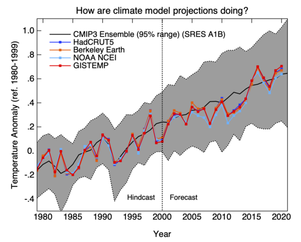
For what it’s worth, any claims you may have heard that there is a gap between the major climate model projections for global temperature and actual observed temperatures are false.
In the chart below, a composite model of climate change projections is compared to four of the most widely-respected datasets of actual, measured, and globally averaged temperature measures:
UK Meteorological Office/Hadley Center’s Climate Research Unit HadCRUT5
NOAA’s National Centers for Environmental Information (NCEI)
NASA’s Goddard Institute for Space Studies (GISS) GISTEMP
Berkeley Earth http://berkeleyearth.org/
The black line on the chart is the Coupled Model Intercomparison Project phase 3 (CMIP3), which combines multiple projections/predictions into a single projection. The gray area represents the area of 95% certainty around that single projection (essentially, it encompasses 95% of the variability in the various models, most of that variability based on different scenarios for the future, such as population growth/decline, increase/reduction in the use of fossil fuels).
Although neither is used in the chart, the datasets of both Japan’s Meteorological Agency (JMA) and the EU’s Copernicus Climate Change Service (C3S) are in close agreement with the others.
Climate models and projections of global warming have proven to be extremely reliable.
Charles Aulds07 March 2021
06 March 2021


